I'm the guy who created the version version of Apple's iMovie back in 1998 so my thoughts about the new iMovie might be biased. On the other hand, I know a lot about software and movie editing.
Apple tossed out iMovie this year and rewrote it from scratch. They got it wrong. The new iMovie... well, it sucks. I still have friends on the iMovie team (for a little while longer, at least), but I don't care. I'm going to blast it anyway, as the piece of useless eye-candy junk that it is.
I have a lot of specific reasons as to why that is the case. It's not just the missing features, or the fact that it can't even open an existing iMovie project, which is Cardinal Sin #1 in any advanced version of a project- or document-based software product.
I did a brief test run with the new iMovie, which I will heretofore call "iTube", because it shouldn't really be called iMovie. I put it through some quick paces, found an inordinate number of bugs, and gave up. But I remained silent, because I had a feeling that I was just being negative since they had just thrown my baby out with the bath water.
But today my daughter, who is 11, and who has a brand new iMac, asked for help with iMovie, since she knew I had created it. I saw that she was in fact using "iTube", and she was confused. She had shot some DV footage with a friend and wanted to edit it. I watched. As user experiences go, it was an unmitigated disaster. Georgia, a competent 6th grader, and her friend, a high school sophomore, could not do anything useful with the program. They had trouble importing the footage, because the "Automatic" mode simply didn't work. An uplug/replug of the camer and switch to Manual mode fixed the import. But that was just the beginning of the issues. There were an incredible number of individual clips, or "Events", since the girls were trigger happy in turning the camera on and off. They couldn't figure out what they were supposed to do, what they were looking at, or even how to "play the movie", which is of course the first thing you want to do after you import footage.
The first thing I noticed is that you simply can't "scrub" through a movie any more. The clips are arranged with carriage returns every so many clips, instead of in a linear fashion, so you simply cannot drag the cursor through the entire movie, because there's no way to navigate through one of the carriage returns (going from the far right end of one line of clips to the left of the next line of clips). The "Skimming" feature goes from novel but useless to annoying in about 5 minutes. It is activated simply by mousing over footage, so as you move the mouse around the program, the screen is constantly moving around on you, moving your point of reference in the movie, and pissing you off. There's simply no way to navigate through the footage!
I have heard the argument as to why the new "iTube" was necessary. Editing movies is too hard. Nobody does it. It needed to be simplified (again). This is all true. But it's not the editor itself that was or is the problem. It's because video is a time-based medium; therefore it takes TIME to edit it. There's no way around that.
Consider this... You've shot 1 hour of video footage on your camera. You come home and decide you want to make something out of it to show your friends or family. It takes 1 hour to import the footage into your computer. It takes another hour to watch it through once. If you stop, start, and enjoy it at all, it'll take you more than 1 hour. If you do NO EDITING at all, and decide to burn it straight to a DVD, or upload it to uTube, it will take you another hour in production time. You're THREE HOURS into the project and you haven't done a single edit. It's my contention that, if you're going to invest hours in just getting the footage from one place to another, and you don't edit it, you're missing the fun part. To scrub through video footage, play snippets, cut out the bad parts, pull it together into something presentable, is fun. Yes, it's time consuming, but it's fun, and rewarding.
The whole premise of "iTube" seems to be that you should short-cut the editing down to simply arranging clips and maybe throwing in some music, because, as the story goes, it was too hard to do that before. Well, after almost 10 years of people loving iMovie and making some pretty amazing movies with it, I have to disagree that it was too hard to use, and that was what was making people not edit their video footage.
Back to my critique of "iTube".
There's no timeline view, which on the surface seems like a "power user" feature. It is. But since video is time-based, if you're even a little bit interested in editing it, you start understanding the timeline and using it. If you're adding music or sound, it's critical to be able to operate in a linear time-based view. There's no way around it, I don't think. Just removing the feature isn't a way around it.
The idea of an "Event Library" is a pro feature. It doesn't map to the way families and amateurs create and reuse video. A clip/event library presumes that you have a lot of beautifully-shot, well-lit clips that can be rearranged to tell a story, or to compel people to vote for you in the Oscars. If you have a 3rd Birthday Party on one DV tape and a Trip to Yosemite on another, are you really going to love all that footage being in a Library so you can re-use it to make your masterpiece of cinema. No, you're not.
The "iTube" interface is very cluttered. There are a whole bunch of rectangles with unclear purpose, a lot of thumbnails and pieces of video everywhere you look, but no clear sense of what is your "movie" and what is not. Gone is the simplicity of One Big Window showing your movie, and a simple list of clips that comprise that movie. How is this new interface "simpler" or "easier to use" or "better"? There isn't a single thing to recommend it, and it violates all sorts of basic principles of Human Interface Design.
There is a tool bar in the center of the window (now there's innovation!) with commands that loosely map to menu commands, as all toolbars do, but you can't customize the toolbar, which has been a toolbar staple for about 15 years now. Nor can you figure out what any of the icons mean without the tool tips. Icons were supposed to be superior to text menus, but in this case I'd rather just use the menus. The first icon in the list, one that you instinctively mouse over to see what this new app is all about, says, "Add Selection to Project". The next one says, "Mark Selection as Favorite". Ummmm, okay, whatever. What selection? What project?
My favorite icon/button is a double-arrow that looks like a recycling icon that says "Swap Events and Projects". This lets you customize that one aspect of the interface, oddly, since no other aspect is customizable. It also suggests that Apple is not confident that the Events and Projects rectangles are in the right place. Why would you make it so easy to swap them? Why would you use a very prominent button in the user interface for something which you should probably never do, and at best will do once in the lifetime of owning the program? It's a fricking preference, not a major button in the interface.
The whole thing is incredibly poorly thought-out, hard to use, annoying, and, at the end of the day, not really a movie editor at all.
This app should have been called iTube 0.8, not iMovie '08. It's certainly a 0.8 app, not a 1.0 app, and it's certainly not iMovie.
Sunday, September 30, 2007
Monday, September 24, 2007
Tesla Motors spotting
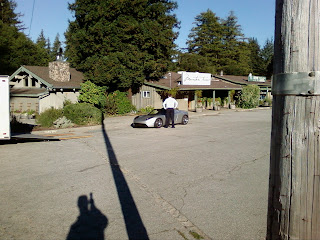
Today I spotted a prototype Tesla car up on Skyline Blvd. I had rushed over to talk to whoever it was, but it was clear that an interview was in progress so I didn't interrupt. The car looks very cool when you're next to it; a little smaller than I had imagined, but cool.

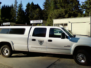
The best part was when the truck/trailer that was hauling the car up to Skyline stopped to refuel. Something very ironic about a Tesla vehicle stopped at a gas pump.

I asked the guy if I could buy what he had in his trailer, but he said it was an "unsaleable" prototype. Too bad.
I am a huge fan of Tesla Motors and can't wait for them to succeed!

The best part was when the truck/trailer that was hauling the car up to Skyline stopped to refuel. Something very ironic about a Tesla vehicle stopped at a gas pump.

I asked the guy if I could buy what he had in his trailer, but he said it was an "unsaleable" prototype. Too bad.
I am a huge fan of Tesla Motors and can't wait for them to succeed!
Subscribe to:
Comments (Atom)